It may seem obvious but how you organise the layout of your email can make a huge difference to what impact it has on the reader… and your click rates.
In this post, we’ll be exploring how to prioritize your email content to make sure your subscribers are reading and engaging with it.
How we read online
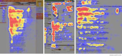
The first thing you should know is that time and time again, users have been shown to read emails and web pages in an F shape. Have a look at the eye-tracking results below – red indicates the ‘hot area’ where the user spends more time looking.

Although they are not all exactly the same, the F shape can still clearly be seen on the pages. The pattern moves left to right, then down, left to right again and down. But what does this mean for your email design? The left side is the most important.
If you’re looking to get the most out of your email, you need to position what you want to the customer down that left hand side. It could be text, or an image, it’s whatever you want to stand out to your reader.
By the way, the result is the same but reversed if the language is right to left, thus making the right side the most important.
So if you’ve got a blog post you really want to plug, or you are wondering where to position your best selling products in the layout, there’s your answer!
Getting your point across
It also goes without saying that your most important content should be at the top too. The further down you go, the more the recipient is going to start skim reading the email and not give it their full attention. So if you’re promoting an offer, then you’ll want to highlight that information at the top.
If you’re using your subject line to let the recipient know the content of email, then don’t make them search the email to find it. Make it stand out – a picture and bright colours as well as the positioning of it, will help guide your readers to what you want them to pay attention to. Don’t forget to use a button to pull out a link you want people to click on.
Setting out your paragraphs
With paragraphs, again, for clarity, get the most important information upfront. Try not to write really long paragraphs as your recipients will be trying to pick out key words from the text. If you look at the eye-tracking results again, you might be able to see that the one on the right is actually from a search engine results page. Much more time is spent over words that the user instantly recognises or is actively looking for.
It’s actually much easier and quicker to read paragraphs when they’re broken down into bitesize parts, which means your user is more likely to read them instead of skimming or avoiding them altogether.
Headings that make an impact
Don’t forget to pay careful attention to the headings you’re using! They’re perfect for breaking up content and separating it into sections. Write headings that state their purpose and give that part of your newsletter an identity.
Remember: Headings should always be kept short but they should stimulate action or guide the reader.
Don’t go header crazy
We know you want to show off your brand with a big fancy header at the top of your email, but don’t get too carried away and have it take over your whole email. Ideally, we’d recommend that your header isn’t more than 150px high. Remember that people will see your logo every time you open one of your emails, and it’s not the most important thing in it!


Important tips!
Thanks for your help.
What is your header image supposed to say?
What is most important and
what is least important?
Hi Mike, the image is just to give some idea of the post. It explains that you put your most important content at the top of your email and the least important at the bottom.