What are newsletter landing pages?
A landing page is a web page where all of the content is created with the goal of getting visitors to take a specific action, such as making a specific purchase. In the case of newsletter landing pages, also sometimes referred to as squeeze pages, the goal is to get visitors to sign up for your email newsletter.
Landing pages take longer to create than your average signup form, but they’re worth the time: they offer a signup rate of 23%. This is significantly more than the next highest signup rate of 10% for “Wheel of Fortune” forms.
Your landing page doesn’t have to be complicated either. A single screen with a high-quality image, some text describing your newsletter, and a signup form is all you really need, as demonstrated by the Dreamforce 2019 landing page:
You can create landing pages in the regular WordPress editor or by using a specialized landing page tool.
Best practices for newsletter landing pages
1. Get specific about your goals
The first thing you’ll need to do is establish goals that can actually be measured for your newsletter landing page. These should include a) how many visitors you want the landing page to get each day and b) what percentage of those visitors you want to turn into subscribers. For example, you might set a goal of 500 views/day with a 20% subscription rate.
So, how do you choose your goal numbers?
First, let’s talk about your visitor goal. This is the harder number to determine, because there are numerous factors that impact it. For example, if you’re turning your home page into a landing page you may expect it to receive a lot of views, since anyone looking up your site will be directed to it. On the other hand, if your site usually has low traffic levels, your homepage might get fewer visitors than a landing page tied to a major marketing campaign.
This means that you need to consider how many visitors your site usually gets, the success of previous marketing campaigns, and how you plan to market this landing page. You can then create a goal that is challenging yet possible to attain for a business with your current audience/traffic levels and resources. Personally, I like to create a number I think is reasonable, then bump it up 20% to give myself a challenge.
Next, let’s talk about your goal subscription rate. The temptation here is to base your goal on the average rate for your industry, but it’s important to remember that many landing pages don’t even follow basic rules of modern web design; as many as half of existing landing pages aren’t even optimized for mobile, and the average landing page conversion rate across industries is still 9.7%. Since you’ll be working with responsive design tools like the WordPress editor and/or specialty landing page builders, you can assume your subscriber rate will be significantly higher; a subscriber rate of 20% or even 30% might be a reasonable goal, especially if you have a high-quality signup bonus.
2. Write persuasive copy
The text of your landing page needs to make a compelling argument to win over visitors who might not be sure about your newsletter.
You can use several strategies to achieve this with your copy:
- Focus on the benefits your newsletter provides. People know that their email address is valuable to you. What you need to do is establish that your newsletter is also valuable to them. For example, you might focus on the opportunity to access subscriber-only discounts.
- Establish your expertise. Show people that you can be trusted by sharing the story of how you started your business, your professional credentials, or the number of years you’ve been in business. Case studies that show how you’ve helped people or businesses in the past can also act as proof of expertise and social proof (we’ll talk more about social proof later).
- Get specific with your calls to action. Your calls to action should use specific language like “Sign up” or “Join the club”. You may also want to create and include a branded name for your subscribers, like KJ Harrowick has done for her fan club, Hàlön Crew:
- Use simple language. It’s important to remember that the average person in the US reads at an eighth grade level. This means that most of the time, simpler language is better. After all, if a person is confused about what you’re offering, they’re probably not going to sign up. However, you also need to remember your audience. If they’re used to more advanced language from your brand or brands like yours, you’ll want to stick with that language.
- Keep your paragraphs short. Short paragraphs are easier to read on the screen and allow for more white space.
You should also run your copy through at least one round of edits, looking for ways to tighten the text and also eliminating any spelling or grammar errors.
3. Make your calls to action highly visible
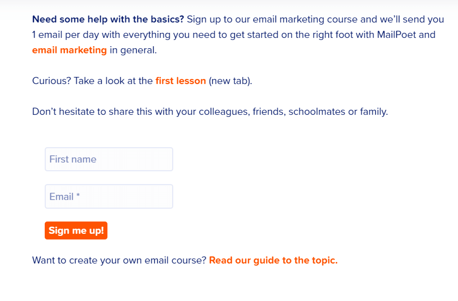
There are two aspects to this. First, your newsletter landing page should have a call to action (CTA) above the fold (content visible before you scroll down) and another one on every screen. This allows your visitor to stop reading and take action at any point as they scroll through your page.
Second, the visual design of your page should make the call to action highly visible. The easiest ways to do this are by putting your CTA in a button and using contrasting colors. For example, if the background of your page is white, you might add a black CTA button with white text.
You can take this a step further by using directional elements to guide the viewer’s gaze to the call to action. For example, you might have a photograph of a person whose face is pointed toward your signup form.
4. Display social proof
Social proof is anything that shows that your business has helped people in the past. This can be as simple as a headline on your site declaring that you’ve had 2,000 satisfied customers or as complex as a video testimonial from a past client. You might even want to use both of these strategies, placing a short line about the number of people you’ve helped above the fold and a series of reviews below it.
There are a couple of strategies you can use to maximize the effect of your social proof:
- Use excerpts instead of full reviews. Pull the most complimentary or informative quotes from a review and leave the rest.
- Get permission to use photos. Photos establish that your testimonials were created by real people.
If you don’t currently have any reviews or testimonials, check out our guide on how to ask for feedback via email.
5. Use large, high quality images

The visual aspects of your landing page are just as important as the text. This makes it important to use only your highest quality photos and illustrations. You also want to make sure that these images appear in a large enough format for the details to be clear.
However, you don’t want the actual file size of your images to be large, as this can slow down your landing page. To remedy this, run any images you’re planning to use through a free file compressor like TinyPNG.
6. Add a video
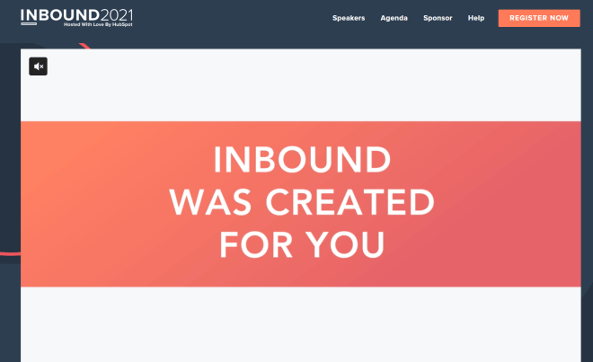
If you’ve spent any time at all in the digital marketing world, you’ve probably heard that video is the next big thing. And it’s true for landing pages too: embedded video content can increase conversions by as much as 86%.
The type of video you publish on your newsletter landing page will vary based on what you’re offering. Here are a few examples:
- If you have an opt-in bonus, you can create a video explaining how users can benefit from it.
- If your newsletter offers weekly business tips, you can create a video of yourself reading tips from past newsletters.
- If your newsletter features updates on your creative work, you can create a video sharing how you got into this type of creative work in the first place.
And of course, you can also add video testimonials related to your opt-in bonus or newsletter.
7. Eliminate distractions
Everything on your newsletter landing page should be focused on getting people to subscribe. In many cases, companies don’t even put navigation menus on landing pages. Others move the navigation bar to the bottom of the page so that people only find it if they’re actively looking for it.
The main exception to this is if you’re using your homepage as a newsletter landing page. Since your homepage is the main hub of your site, you want to leave navigation intact for visitors trying to find specific information.
8. Use the testing tools available to you
If you’re using one of the landing page tools I mentioned earlier, make sure you take advantage of the testing tools you have access to. These tools let you test content before you send out a major marketing campaign, allowing you to refine your landing page before publishing it.
If you’ve never run these kinds of tests before, check out the VWO guide to A/B testing.
9. Check your analytics regularly
The best landing pages are the ones that are refined over time, with changes made based on real data. This means making a regular appointment with yourself to go through your analytics, watching for trends.
Here are some things to look at:
- How many people visit your landing page per day/week/month. This can tell you if your marketing campaigns are actually driving traffic to your landing page. If your visitor numbers are low, you’ll need to reevaluate your overall newsletter marketing strategy.
- Where visitors come from. This tells you what your most effective marketing channels are most effective, what platforms you can improve your marketing on, and what platforms are performing so poorly that you may want to stop using them altogether.
- How much time people spend on your page. If people are only spending a few seconds on your landing page, it might indicate that you’re failing to meet user expectations or that something on the page is broken.
- Subscriber rate. If you’re using a landing page builder like Unbounce, you’ll be able to toggle conversion rate tracking for this. Otherwise, you’ll need to rely on the analytics for the signup forms used and/or linked to on your newsletter landing page.
- What CTA drives the most conversions. You can figure this out either by looking at the most-clicked links on a given page or by tracking the stats of specific signup forms. In most cases, this will be the first one because it’s the most visible. If a different call to action gets more attention, it may mean that your original CTA isn’t compelling enough.
As for how often you should look at these statistics, it depends on your goals. If the landing page is part of a short-term marketing campaign, you might want to look at your analytics weekly or even daily, giving yourself the ability to pivot quickly if your campaign is tanking.
On the other hand, if you’re turning your homepage into a landing page, you might only want to check your analytics once a month or even once every three months. Really, the key is to check often enough that you can address the cause of any sudden dips in traffic before you start losing money.
10. Make multiple landing pages
I’m always talking about the importance of personalization in email marketing, and it can be used here too. Specifically, you can create different landing pages for people who are introduced to your content in different ways. For example, you might have personalized newsletter landing pages for the following groups:
- People who come to your landing page from social media
- Users who reach your landing page by searching for specific keywords
- People who clicked on specific advertising campaigns
- Users referred to your landing page by a member of your audience
You don’t need to reinvent your landing page completely for each group either. Instead, you can create a duplicate of your initial landing page, then change a few words or images to better suit the audience this page is for. For example, if you’re personalizing the landing page for someone who looked up a specific keyword, you might make sure that keyword appears more often than it does on the regular page.
Newsletter landing page examples
Publisher Weekly
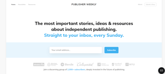
The Publisher Weekly landing page is simple, without any imagery, animations, or other complex elements. Instead, it uses a couple of lines of text to explain what visitors get when they subscribe to the newsletter.
If that isn’t quite enough of you, Publisher Weekly offers two forms of social proof: the logos of professional organizations that rely on this newsletter and a line about joining their 2,000+ subscribers. This establishes that Publisher Weekly is a reputable source.
Overthink
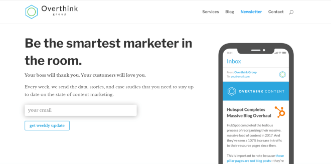
There are a few reasons to love this newsletter landing page:
- Simple, clean design with minimal distractions
- Copy that spells out exactly what subscribers can expect
- Highly specific call to action
- An image of what the newsletter will look like when people open it on their phones, complete with a headline and article you might find in the newsletter
All in all, it’s one of the best newsletter landing pages I’ve seen, and it proves that you don’t need to put in a lot of work to create an effective landing page.
Close
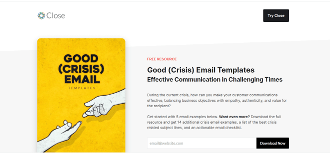
This newsletter landing page centers an opt-in bonus instead of the newsletter itself. The cover image is eye catching and the hand shapes direct the action to the page’s headline. The text goes on to explain exactly what subscribers will get, reinforcing this idea with the “Download Now” CTA. Personally, I might have added a line about what subscribers can expect from the newsletter in the long run, but this page is already quite effective.
Newsletter landing page tools
There are several specialized tools for creating effective newsletter landing pages. These often use a block system similar to the WordPress block editor, but offer additional tools like A/B testing and conversion tracking.
Here’s a quick run-down of three of the most popular newsletter landing page tools:
1. WP ProfitBuilder
Standout features
- Over 100 landing page templates designed for specific purposes like lead generation and sales
- Drag and drop builder
- Fast loading pages
- A/B testing
- Funnel builder and analytics
- Conversion tracking
Overview
WP ProfitBuilder is a WordPress plugin with a flexible page builder, a growing library of page templates optimized for lead generation, and A/B testing capabilities.
As a WordPress plugin, WP ProfitBuilder is also directly compatible with MailPoet signup forms. This allows you to skip the use of third-party tools like OptInMonster.
Cost
You can buy a license for WP ProfitBuilder for a one time payment of $47 (usually $197). If you have multiple sites, you can buy a $67 (usually $297) license that works on up to 10 sites or a $67.67 (usually $497) license for 50 sites.
2. Instapage
Standout features
- Unlimited landing pages
- Unlimited conversions
- Template library with over 500 layouts
- Unique conversion tracking system
- Accelerated Mobile Pages (AMP)
- InstaBlocks
- A/B testing
- Multivariate testing
- Real-time visual collaboration
- Option to work with Instapage experts to optimize your landing page
- Advanced analytics
- AdMap for connecting individual landing pages to specific ads
These features are included with the Building plan. Check out the pricing page for more details.
Overview
Instapage is an advanced landing page builder that uses InstaBlocks, a design system similar to the WordPress block editor. This makes it remarkably easy for experienced WordPress users to make landing pages with Instapage. They can then publish their newsletter landing pages directly to WordPress.
Unfortunately, Instapage doesn’t integrate directly with MailPoet. If you want to display an opt-in form on an Instapage landing page, you’ll need to use a third-party form builder that integrates with both MailPoet and Instapage, such as OptInMonster.
Cost
The basic plan of Instapage costs $199/month ($2388/year). when purchased annually. Instapage also offers custom plans; you can find more about these on the Instapage pricing page.
3. Unbounce
Standout features
- Unlimited landing pages, pop ups, and sticky bars
- Access to both the classic drag and drop builder and the new Smart Builder
- Conversion tracking
- Conversion mapping
- Unlimited client sub-accounts
Overview
Unbounce gives users access to a variety of AI-powered tools that make it easier to both create a successful landing page and refine that landing page over time. The company recently unveiled the Smart Builder, an upgraded landing page builder with several new features, including an AI-powered Design Assistant.
The downside of Unbounce is that it doesn’t integrate directly with the WordPress block editor, so you can’t paste MailPoet forms directly onto landing pages built with this tool. To put forms directly on an Unbounce landing page, you’ll need to use a tool like OptInMonster that integrates with both MailPoet and Unbounce.
Cost
The Launch plan from Unbounce costs $81/month ($972/year) when purchased annually and allows for up to 500 conversions. Plans go up to $225/month.
Final advice on building your newsletter landing page
Landing pages are incredibly powerful marketing tools that can be created for anything: a product, a service, an event, and of course, your newsletter. You can use a tool like Instapage or Unbounce to create a newsletter landing page, but all you really need is WordPress and some best principles:
- Get specific about your goals
- Write persuasive copy
- Make your calls to action highly visible
- Add social proof, especially if you have visual social proof
- Use large, high quality images
- Add a video
- Eliminate distractions
- Use any testing tools you have access to
- Check your analytics regularly, using the data to refine your landing page over time
- Create multiple landing pages
Most of all, remember that a landing page doesn’t have to be complicated. In fact, many of the best newsletter landing pages are quite simple. Yours can be too.


good job