Your newsletter signup form is perhaps the most important part of your lead generation strategy, but is it truly serving you? In this guide, I’ll explore nine ways to make your newsletter signup form work harder and drive more conversions.
We’ll discuss:
- Where to place your newsletter signup form
- Types of signup forms + how to create them in MailPoet
- What makes effective signup form copy
- How to create a compelling call to action
And more!
By the time you’re finished reading, you’ll have all of the knowledge you need to create effective newsletter signup forms.
1. Choose a strategic location for your newsletter signup form
Many business owners place a signup form somewhere in their sidebar and leave it there, giving no real thought to form placement. This is better than having no signup form at all, but you can drive more conversions with strategic placement. Even making sure that your signup form is at the top of your sidebar, rather than placing it haphazardly into the middle of the sidebar, can make a difference.
To encourage more subscriptions, consider placing an additional signup form in one or more of the following places:
- Directly under your top menu
- At the end of each blog post
- In your footer
- In a slide-in form (more on those later) at the bottom of the page
This ensures that your visitors encounter your signup forms consistently as they explore your site and read your content.
2. Use multiple types of forms
You’ll notice pretty quickly that your usual newsletter signup form doesn’t look good in every location. Sometimes all you need to do is change the dimensions, but often you’ll need to create a wholly different type of form.
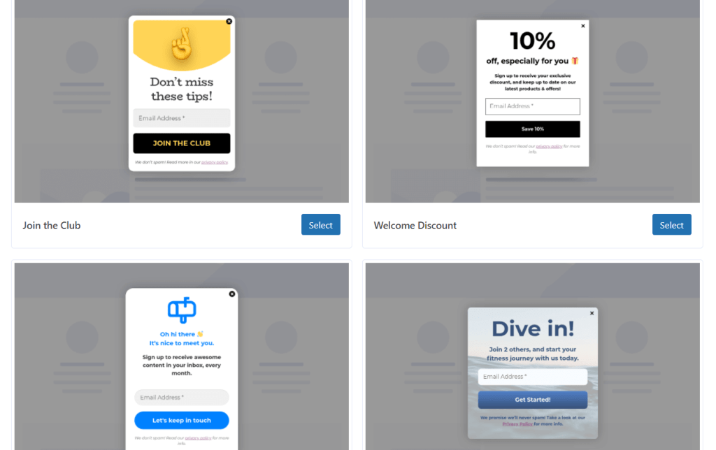
Here’s a quick rundown of popular types of signup forms:
- Embedded forms. These forms are designed to be embedded directly into your content. You can use these forms in your sidebar, the header or footer of your site, and at the end of long-form content pages.
- Fixed bar forms. Also known as floating bar forms, these are signup forms in a bar across the top of your page. These forms follow your visitor as they scroll down the page, so they can subscribe to your newsletter at any point.
- Pop-up forms. Perhaps the most infamous signup forms, these forms open over the page you’re looking at. Many people consider these forms intrusive, since they block the primary content from view. On the other hand, this level of visibility means that people can’t escape it. Plus, you can set it up so that your pop-up form appears after users have read your content.
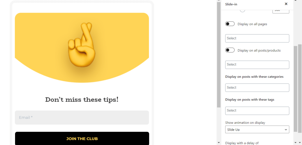
- Slide-in forms. These signup forms slide into view as a user scrolls down the page. Typically the first view of the form is a tab that appears on the bottom or side of the page asking users to click for more. When users click on this tab, the full form appears. These are a great compromise between embedded forms and pop-up forms, since they follow users through the page without obstructing content.
Take a look at our ultimate guide on how to use pop-ups, slide-ins, fixed bar forms, and more!

3. Use time delay and exit-intent technology when possible
One of the biggest advantages of modern pop up and slide-in forms is that you can set them up to display after users have interacted with your content. There are a couple of ways to do this:
- Time delay. This feature allows you to specify how long a person must be on your page for this form to appear. Typically this is expressed as a number of seconds. In MailPoet, time delays can be added to both pop-up and slide-in forms.
- Exit-intent. When this setting is enabled, your newsletter signup will appear when someone attempts to leave a page. In MailPoet, this setting currently only exists for pop-up forms.
As a MailPoet user, you can customize these settings in the sidebar of the form builder. For more detail on how to use exit-intent forms effectively and how to set them up in WordPress, take a look at our guide.

4. Write compelling copy
There isn’t a lot of space for text in more signup forms, which means you’ll need to convince visitors to subscribe with one or two sentences. Some forms, like fixed bar forms, might only have space for a few words.
There are several strategies you can use to write compelling signup form copy:
- Set clear expectations. Tell viewers exactly what they’ll get when they sign up for your newsletter.
- Create a sense of exclusivity. Focus on the content your subscribers will get that can’t be found anywhere else, even on your website. This shows visitors that your newsletter is a unique and valuable experience.
- Be clear about how you’ll use data. Specifically, explain that you won’t spam the person or share their data with anyone else.
- Use your brand voice. The copy on your signup form should feel like part of your overall brand experience. For example, if most of your content is light and humorous, you might add a joke to your signup form copy.
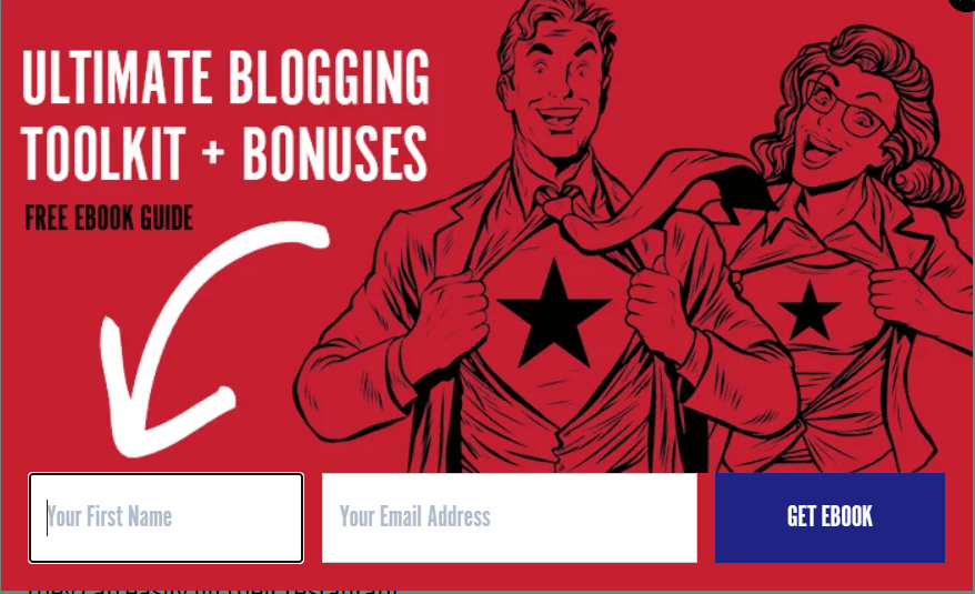
- Emphasize your opt-in bonus. If you have a signup bonus like a discount or free content, you want to tell visitors about it here.
Most of all, don’t just go with the first thing you think of. Draft a variety of pitches for your signup form, choose the best one, and edit it until it sparkles. If you have employees, you may also want to ask them for feedback.
5. Use a specific call to action

A generic call to action like “sign up” or “join now” gets the message across, but you can make your signup form even more effective by mentioning exactly what users will get.
Here are some examples of more specific calls to action:
- Join my fan club
- Grab your free book
- Claim your discount
- Start learning
All of these calls to action provide a specific impression of why people are signing up for your newsletter, whether it’s an affinity for your work or the desire to grab a discount. And these are just what I thought up in a couple of minutes. Your deep understanding of your brand can help you create an even more specific call to action. For example, if your fans have a nickname like “greencoats”, you might use the call to action “Become a greencoat”.
6. Make your newsletter signup form easy to use

Your signup form should provide a clear path to joining your newsletter, not put obstacles in visitors’ way.
There are a few ways to make sure your signup form is easy to use:
- Only ask for information you actually need. Your signup form should only require people to enter their email addresses and possibly their names. Other information about your audience can be discovered through a combination of analytics and surveys.
- Make the signup button clearly visible. The signup button should be fairly large and use contrasting colors to make it “pop” off of the screen.
- Make sure it’s mobile responsive. If your form doesn’t work well on mobile devices, you could be missing out on a chance to convert more than half of your visitors. Luckily, MailPoet signup form templates are already responsive!
You may also want to look into the basics of accessible web design to make your signup form (and other content) accessible to a wider range of people.
7. Create an opt-in bonus
An opt-in bonus or signup bonus is a reward given to subscribers when they sign up for your newsletter, such as a discount. These bonuses can then be used as the focal point for lead generation campaigns.
Your signup bonus can be anything that’s both relevant to your business and beneficial to your customers. Some common opt-in bonuses are discounts, short ebooks, and exclusive video or email courses. Personally, I suggest choosing a signup bonus that you don’t have to put a lot of up-front work into, like a discount or access to an expanded version of a blog post you’ve already written.
Once you’ve created your opt-in bonus, you can rewrite all of your marketing content, including the text of your signup form, to emphasize the signup bonus. You can also create a new landing page that focuses on your signup bonus. For more information on how to use these, take a look at our guide.
Time-limited signup bonuses
A great way to get a large number of subscribers to your newsletter is to offer an opt-in bonus with a time limit, such as entry into a competition or a limited-time discount. This creates a sense of urgency, encouraging users to sign up right away so they can get the full benefits.
8. Incorporate social proof
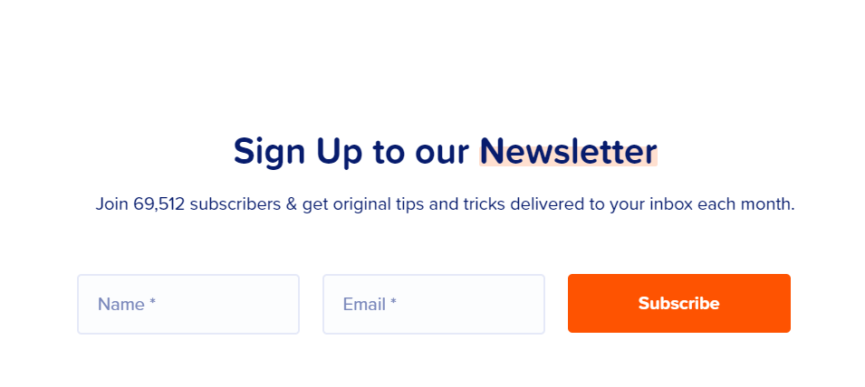
Social proof is anything that shows that people have interacted with and enjoyed your content. Most often when I talk about social proof, I’m referring to reviews, testimonials, and social media posts about your brand, but there are other ways to demonstrate social proof. For example, you might display the number of people already subscribed to your newsletter.
If you do decide to add a testimonial or review to your opt-in form, you’ll want to keep a few guidelines in mind:
- Use social proof that talks specifically about subscriber benefits. For example, if you offer an ebook as an opt-in bonus, you might choose a testimonial that talks about the benefits of that ebook.
- Keep it short. Even in a pop-up or slide-in form, you only have space for 1-2 sentences. This might mean taking an excerpt from a testimonial instead of using the whole thing.
- Weave it into your copy. Since there isn’t a lot of room, you want to make sure your copy flows smoothly into your testimonial. In some instances, the testimonial can even serve as the copy.
- Include a picture. If you have a photo of the person who gave you the testimonial, use it. This reinforces the idea that your review came from a real person.
If you don’t have any reviews or testimonials yet, check out our guide to asking for customer feedback by email.
9. Make it pretty

Your signup form should draw the eye and contribute to the visual experience of your site. There are a few things you can do to accomplish this while building your signup form:
- Incorporate your brand colors and imagery.
- Add an animation; our eyes are naturally attracted to movement.
- Use a font that emphasizes legibility; handwriting-style fonts are pretty, but they can be difficult to read.
- Make sure the font is large enough to be seen properly by visually impaired users and on small screens.
- Test what your signup form looks like on different devices. You can use a free tool like Responsinator to see what your form, and your website as a whole, will look like on various devices.
For more information on designing your signup forms, check out our guide to creating mobile-friendly signup forms.
Final thoughts
Throwing a signup form into your sidebar and calling it a day is better than not having a signup form at all, but there are a lot of ways you can optimize that form to drive more conversions:
- Place multiple forms in strategic locations on your site
- Use a variety of form types, being sure to take of specialized features like the ability to set a time delay
- Refine your copy with a goal of explaining the benefits subscribers will get in as few words as possible
- Create a specific call to action
- Make sure your forms are easy to use
- Offer some kind of opt-in bonus
- Feature a testimonial, ideally related to the newsletter itself or to your opt-in bonus
- Use your brand colors and imagery to make your signup form feel like part of the experience of your site
With these rules in mind, you’ll find yourself getting more subscribers in no time!


Hi,
I couldn’t find any support email address so left a message here.
I’d like to use your service for our website. I’ve read your articles about subscription form: https://kb.mailpoet.com/category/139-subscription-forms
They are useful to get a sense how the form works though, it seems that the form can be placed in a widget only. I was wondering if your service may have a to make the form pop up in main page? (or in other pages with time intervals?)
It would really help to understand your service.
Thank you,
Soo, MailPoet only offers forms as widget or shortcode.
We’re currently started to redesign our form editor. In 2020, you will be able to have different types of forms.
This said, you can find a variety of third party form plugins that work with MailPoet:
https://kb.mailpoet.com/article/198-forms-themes-plugins-that-work-with-mailpoet
Great post, Raelene!
I agree email newsletters are of course a proven way to communicate to current or potential customers and having a solid email list allows generating traffic and sales even when don’t invest in other acquisition channels. But building this solid email list might not be that simple, because the classic “Subscribe to our newsletter” form at the bottom of the homepage might not have enough reason for visitors to opt-in.
I wrote a blog post about 7 effective way to increase email newsletter sign ups, hope it will be useful -> https://www.personizely.net/blog/7-tips-to-encourage-visitors-to-newsletter-signups
I have two questions:
1. I need to tailor the sign-up (bilingual) and don’t see how to generate the E-mail field, which I would like to place on the same line as the Name field, as in your example.
2. Is this subscription only for Newsletters? Can I automatically inform subscribers of new posts?
good